
Wydawca: 8
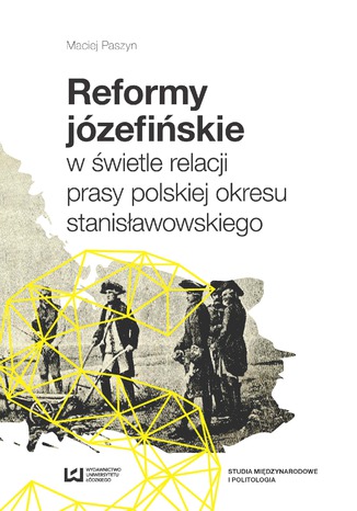
Reformy józefińskie w świetle relacji prasy polskiej okresu stanisławowskiego
Maciej Paszyn
Reformy państwa habsburskiego, dokonane przez Józefa II w latach 1780–1790, były nie tylko kontynuacją, lecz także rozwinięciem zmian, jakie poczyniła jego matka Maria Teresa. W literaturze przedmiotu reformy te nazywane są terezjańsko-józefińskimi. Jednak to reformy Józefa II zmieniły i wzmocniły monarchię naddunajską. Zmiany w funkcjonowaniu administracji, armii, gospodarki, reforma kościelna, wszystko to było obserwowane i komentowane przez prasę europejską i elity polityczne. Także polskie gazety wydawane w tym okresie przedstawiały i komentowały działania cesarza – reformatora. W książce, którą dostaje do rąk Czytelnik, autor dokonuje analizy sposobu, w jaki prasa okresu stanisławowskiego przedstawiała wydarzenia w monarchii naddunajskiej. Ponadto, dla porównania, ukazane zostało, w jaki sposób działania Józefa II opisywały gazety wydawane w Wiedniu. Ta podwójna optyka pozwoli na uzyskanie pełniejszego obrazu działań cesarza w prasie zarówno polskiej jak i austriackiej tego okresu. Książka powstała dzięki kwerendzie dokonanej w polskich i austriackich bibliotekach oraz archiwach.
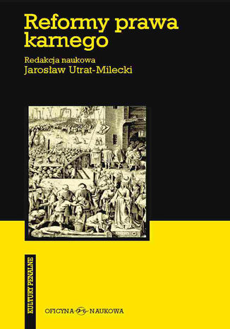
Reformy prawa karnego. W stronę spójności i skuteczności
Jarosław Utrat-Milecki, redakcja naukowa
Redakcja naukowa Jarosław Utrat-Milecki Studia "Kultur Penalnych" otwiera tom zawierający cykl artykułów z zakresu prawa karnego, penologii i kryminologii, które bezpośrednio odnoszą się do wybranych zagadnień związanych z reformami prawa karnego w Polsce na tle tendencji europejskich i światowych. Przedstawione artykuły dotyczą przede wszystkim reform prawa karnego materialnego i prawa karnego wykonawczego oraz odpowiednio postępowania w sprawach nieletnich. Zagadnienia te będą rozwijane w kolejnych trzech tomach poświęconych kulturowym uwarunkowaniom polityki kryminalnej, historyczno-kulturowym i politycznym uwarunkowaniom funkcji sprawiedliwościowej prawa karnego oraz kryminalizacji. W dalszych tomach uwzględniona będzie ponadto kwestia rozwoju studiów kryminalistycznych, a także ewolucji doktryny procesu karnego. Badania przedstawione w tomie czwartym nawiązują do polskiej tradycji studiów socjologicznych wymiaru sprawiedliwości karnej. Studia te w zamierzeniu miałyby stanowić wkład do dalszej racjonalizacji polskiej polityki kryminalnej w zgodzie z najlepszymi tendencjami europejskimi i światowymi, które zobowiązani jesteśmy w świecie nauki analizować krytycznie, a nadto - jako podmiot, a nie przedmiot polityki europejskiej i światowej - współkształtować. Jarosław UTRAT-MILECKI - profesor Uniwersytetu Warszawskiego, pracuje od 1989 r. w Instytucie Profilaktyki Społecznej i Resocjalizacji UW. Stworzył tam Zakład Prawnych i Społecznych Badań Integralnokulturowych oraz w jego ramach Europejski Ośrodek Studiów Penologicznych im. Prof. G. Rejman.
Bogna Gawrońska-Nowak, Jerzy Hausner, Dorota Jopek, Michał...
Zdaniem Jerzego Hausnera i Tadeusza Markowskiego dominująca formuła funkcjonowania współczesnych miast prowadzi nieuchronnie do degeneracji ich potencjału rozwojowego. Aby możliwe było przeciwstawienie się temu zjawisku, potrzebny jest nowy paradygmat - miasta regeneracyjnego, osadzony w szerszej koncepcji regeneratywnego gospodarowania. Konceptualnym jądrem miasta regeneracyjnego jest nowy metabolizm. Rozumiany tu jako zbiór mechanizmów i procesów, które zachodzą w systemie miejskim, metabolizm miasta umożliwia pozyskiwanie i wykorzystanie energii z dostarczonych miastu zasobów. prof. dr hab. Florian Kuźnik Regeneracja miejska to nie kolejna technokratyczna utopia redukująca politykę publiczną do wykorzystywania technologii lub narzędzi marketingu terytorialnego. To idea oparta na pogłębionej diagnozie, przynoszącej odpowiedź na pytanie, do czego prowadzi utrzymywanie obecnych trendów rozwojowych oraz gdzie należy szukać możliwości ich odwrócenia i powstrzymania narastającej entropii. Autorzy przywracają znaczenie źle widzianym słowom, takim jak: wspólnota, solidarność pokoleniowa, dobra wspólne, współdziałanie, współodpowiedzialność. dr hab. Tomasz Nawrocki, prof. UŚ Książka pod redakcją Rafała Matyi poświęcona jest problematyce kształtowania modelu miasta regeneracyjnego, którego rozwój nie tylko przeciwdziała degeneracji przestrzeni miejskiej, lecz także aktywnie wspiera i utrwala społeczną, gospodarczą i ekologiczną odnowę. Regeneracja miast w rozumieniu autorów zbioru nie oznacza prostego odtworzenia, lecz twórczą przemianę dotychczasowych trajektorii rozwoju, opartą na wykorzystaniu w sposób zrównoważony lokalnych zasobów, w tym zasobów ekologicznych, energetycznych, przestrzennych, społecznych i kulturowych. prof. dr hab. Iwona Sagan

Michał Śmielak
Wraz z nadejściem lata mieszkańców wsi Rosochate zastała nowa rzeczywistość. Deweloper postanowił wybudować hotel w sercu Bieszczad, burząc dotychczasowy spokój i sielankowe życie miejscowych. Gdy ryk pił spalinowych niesie się po połoninach, miejscowi kręcą z niedowierzaniem głowami i z lękiem czekają na to, co się wydarzy. Lokalne podania przestrzegają bowiem, że jeśli ktokolwiek zetnie drzewo w zagajniku zwanym Reglem, czeka go śmierć. Odkrycie zwłok stróża pilnującego placu budowy wskazuje na to, że legendy nie kłamały. To jednak dopiero początek koszmaru, ponieważ przebudzone zło nie zamierza poprzestać na jednej ofierze. Starszy aspirant Przemysław Nowacki rusza w pościg za mordercą. I choć doskonale wie, że nie ma mowy o żadnej legendzie, nie zdaje sobie sprawy, jakiej sile stawia czoło. Tajemnice zdają się otaczać go z każdej strony niczym potężne, bieszczadzkie lasy i są groźniejsze od mieszkających w nich demonów. Jednocześnie złu rzuca wyzwanie Maciej, szukający w okolicy zaginionej dziewczyny oraz Oskar, który wrócił w rodzinne strony, by odnaleźć spokój utracony w wielkim mieście. Jak bardzo żywe mogą być legendy? Co może zbudzić zło? I przede wszystkim - jak je ponownie uśpić?

Michał Śmielak
Wraz z nadejściem lata mieszkańców wsi Rosochate zastała nowa rzeczywistość. Deweloper postanowił wybudować hotel w sercu Bieszczad, burząc dotychczasowy spokój i sielankowe życie miejscowych. Gdy ryk pił spalinowych niesie się po połoninach, miejscowi kręcą z niedowierzaniem głowami i z lękiem czekają na to, co się wydarzy. Lokalne podania przestrzegają bowiem, że jeśli ktokolwiek zetnie drzewo w zagajniku zwanym Reglem, czeka go śmierć. Odkrycie zwłok stróża pilnującego placu budowy wskazuje na to, że legendy nie kłamały. To jednak dopiero początek koszmaru, ponieważ przebudzone zło nie zamierza poprzestać na jednej ofierze. Starszy aspirant Przemysław Nowacki rusza w pościg za mordercą. I choć doskonale wie, że nie ma mowy o żadnej legendzie, nie zdaje sobie sprawy, jakiej sile stawia czoło. Tajemnice zdają się otaczać go z każdej strony niczym potężne, bieszczadzkie lasy i są groźniejsze od mieszkających w nich demonów. Jednocześnie złu rzuca wyzwanie Maciej, szukający w okolicy zaginionej dziewczyny oraz Oskar, który wrócił w rodzinne strony, by odnaleźć spokój utracony w wielkim mieście. Jak bardzo żywe mogą być legendy? Co może zbudzić zło? I przede wszystkim - jak je ponownie uśpić?

Henryk Zbierzchowski
Henryk Zbierzchowski Impresye Regina Autumni Idzie już! patrzcie jak stąpa tajemnie Po miękkich mchach Czasem po drodze trawę stopą zemnie A kwiatom strach!!! I jęk powstaje uporczywy, cichy, Jak kiedy miesiąc w dziuple brzozy uśnie, To kwiaty więdną, tuląc się w kielichy, To wiatr w łzach rośnych śpiące kwiaty muśnie. Czasem potrząśnie drzewa skamieniałe W przedzgonnych snach, Liści uwiędłych lecą roje całe, A drzewom strach!... Henryk Zbierzchowski Ur. 19 listopada 1881 we Lwowie Zm. 6 listopada 1942 w Krynicy Najważniejsze dzieła: Małżeństwo Loli, Żongler. Rzeczy wesołe i smutne, Człowiek o dwu twarzach Pisarz związany całe życie ze Lwowem. Debiutował w 1898 r. na łamach krakowskiego czasopisma "Życie", dwa lata później wydał pierwszy tomik poezji, Impresje. Ukończył studia prawnicze. W latach 1906--1910 pracował jako redaktor czasopisma "Nasz Kraj", publikował też w "Gazecie Porannej". Od 1920 r. prowadził czasopismo satyryczne "Szczutki". W 1928 r. miasto Lwów przyznało mu nagrodę literacką, w 1937 r. otrzymał Krzyż Kawalerski Orderu Odrodzenia Polski, rok później Złoty Wawrzyn Akademicki Polskiej Akademii Literatury. W czasie wojny znalazł się w Krynicy i tam zmarł. Pisał liryki, powieści, nowele, piosenki (patriotyczne i kabaretowe) i sztuki teatralne (przeważnie komedie i wodewile). Kupując książkę wspierasz fundację Nowoczesna Polska, która propaguje ideę wolnej kultury. Wolne Lektury to biblioteka internetowa, rozwijana pod patronatem Ministerstwa Edukacji Narodowej. W jej zbiorach znajduje się kilka tysięcy utworów, w tym wiele lektur szkolnych zalecanych do użytku przez MEN, które trafiły już do domeny publicznej. Wszystkie dzieła są odpowiednio opracowane - opatrzone przypisami oraz motywami.
Region a tożsamości transgraniczne. Literatura. Miejsca. Translokacje
praca zbiorowa
Relacje transgraniczne stanowią jeden z istotnych parametrów regionalności jako takiej. W obrębie regionów, które w warunkach polskich w większości są pograniczami, intensyfikują się i nawarstwiają, zwłaszcza w epoce globalizmu i migracji, procesy rozregulowujące homogeniczny porządek w sferze tożsamości i kultury, a granica staje się integralnym elementem doświadczenia codzienności. Literatura regionalna, zapisująca wielorakie konstrukcje „światów pogranicza”, jest z jednej strony dokumentacją tych zjawisk, z drugiej – formą praktykowania transgraniczności kulturowej. Badania regionalistyczne, prowadzone pod tym kątem, pokazują tożsamość kształtującą się w polu oddziaływania wielu etnosów, religii oraz kultur, uwikłaną w skomplikowane układy narodowościowe, etniczne, wyznaniowe, językowe itp., którą można rozpatrywać zarówno w perspektywie jednostkowej (indywidualnych biografii pisarzy), jak i zbiorowej (społeczności regionalnych) z uwzględnieniem przemian historyczno-społecznych. Takie właśnie nachylenie patronuje rozważaniom zawartym w tej książce. Problematyka artykułów zebranych w czwartym tomie serii Nowy regionalizm w badaniach literackich orientuje na podmiotowo traktowane społeczności lokalne oraz obecne w nich translokacje i transgresje, a wpisując się we współczesny dyskurs tożsamości, otwiera na frapujące związki literatury, geografii i biografii.
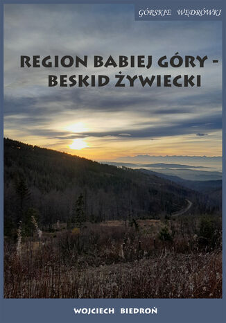
Region Babiej Góry - Beskid Żywiecki Górskie wędrówki
Wojciech Biedroń
Wikipedia przytacza jedną z legend według której na szczycie Babiej Góry diabeł budował zamek dla zbójnika, który podpisał z nim umowę. Jednak gdy zapiał kur, niemal już ukończony zamek zawalił się, grzebiąc w ruinach zbójnika. Podczas burzy można podobno usłyszeć spod głazów brzęk jego ciupagi. Stąd też dla tego szczytu w ludowym nazewnictwie używano nazwy Diablak, Diabli Zamek lub Diable Zamczysko. Ja słyszałem, że podobno kiedyś (nie wiem czy teraz też) na Babiej Górze zbierały się czarownice, aby wziąć udział w sabacie. A to z kolei kojarzy się na przykład ze słynnym obrazem Francisco Goyi, który został zatytułowany nie inaczej jak właśnie "Sabat czarownic". W centralnej części dzieła znajduje się Wielki Kozioł, a więc sam Diabeł, który jest otoczony przez wiedźmy. Kiedy udało mi się wspiąć na Diablak (drugi raz w moim życiu) była piękna słoneczna pogoda i "ocean" z chmur, a więc nic z przytoczonych powyżej mrocznych legend nie miało miejsca. Tak więc tym razem przedstawiam w "górskich wędrówkach" krótki trekking w tej części Beskidu Żywieckiego, jednoczesnie dzieląc się wrażeniami z marszu oraz podając za jednym z przewodników różne warianty tras. Zdecydowanie polecam ten piękny region naszego kraju o każdej porze roku. Przy czym jeśli zdecydujemy się wędrować po szlakach Babiej Góry w okresie później jesieni czy zimy warto zwrócić uwagę na dodatkowe wyposażenie o czym więcej w tekście.