
Wydawca: 8
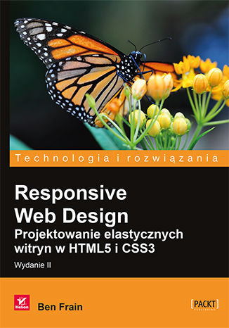
Responsive Web Design. Projektowanie elastycznych witryn w HTML5 i CSS3. Wydanie II
Ben Frain
Profesjonalnie wykonana strona internetowa powinna działać bez zarzutu nie tylko na komputerze stacjonarnym, lecz także na tablecie czy telefonie. Użytkownicy chcą korzystać z aplikacji sieciowych w każdych warunkach i uruchamiać je na urządzeniach o najprzeróżniejszych rozmiarach czy parametrach. Należy się spodziewać, że wkrótce katalog urządzeń podłączanych do internetu znacznie się poszerzy. W takich warunkach projektant koniecznie musi zadbać o responsywność, aby tworzone przez niego strony internetowe dostosowywały się do zmiennych warunków i zachowywały funkcjonalność. Niniejsza książka stanowi kompletne źródło informacji potrzebnych do napisania responsywnej strony internetowej. Jeśli znasz HTML i CSS, możesz z jej pomocą zbudować taką aplikację. Znajdziesz tu opis wszystkich podstawowych aspektów responsywnych projektów stron i dowiesz się, jak korzystać z najbardziej przydatnych technik w technologiach HTML5 i CSS3. Co więcej, odkryjesz najlepsze metody pisania i dostarczania kodu, obrazów i plików. Dzięki licznym przykładom i opisom bez trudu dostosujesz swój projekt do wymagań telefonów komórkowych i wielu innych urządzeń. Wydanie drugie uzupełniono o opis prawie wszystkich najnowszych technik i narzędzi potrzebnych do budowy responsywnych aplikacji internetowych. W tej książce znajdziesz: opis elementów potrzebnych do zbudowania responsywnych stron internetowych informacje o zapytaniach medialnych, ich składni i sposobach wykorzystania omówienie projektowania struktury i układów płynnych oraz wykorzystania modelu Flexbox wskazówki co do wykorzystania niezwykłych możliwości CSS3 i HTML5 wytyczne dotyczące grafiki SVG oraz metody obsługi obrazów SVG z poziomu JavaScriptu wyjaśnienie, jak tworzyć przejścia, transformacje i formularze spis dobrych praktyk kodowania responsywnych stron internetowych Responsywne strony internetowe — będą równie piękne nawet po latach!
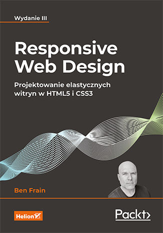
Responsive Web Design. Projektowanie elastycznych witryn w HTML5 i CSS3. Wydanie III
Ben Frain
Jeszcze dziesięć lat temu responsywność strony internetowej była traktowana jako ciekawostka. Dziś jest powszechnym standardem. Znane od dawna klasyczne technologie HTML i CSS wciąż zachowują świeżość i wyjątkową przydatność w tworzeniu nowoczesnych stron internetowych. Społeczności skupione wokół tych narzędzi starannie dbają o ich nieustanny rozwój, dzięki czemu za ich pomocą nadal można osiągać imponujące efekty i spełniać coraz wyższe standardy. Oznacza to, że każdy szanujący się programista front-endu powinien na bieżąco śledzić nowości i uczyć się korzystania z sukcesywnie pojawiających się funkcjonalności HTML i CSS. Ta książka jest kolejnym, uaktualnionym i uzupełnionym wydaniem lubianego podręcznika projektowania responsywnych stron internetowych. Omówiono w niej wszystkie nowości i ulepszenia z dziedziny projektowania responsywnych stron internetowych, w tym zapewnianie lepszej dostępności, fonty zmienne czy kontrola przewijania strony. Szczegółowo opisano moduł CSS Grid i mechanizm tworzenia układów Flexbox. Zaprezentowano wiele praktycznych informacji o SVG, wymogach dostępności, efektach w CSS, definiowaniu przejść, transformacji i animacji oraz włączaniu do kodu zapytań medialnych. Znakomitym uzupełnieniem treści są autorskie wskazówki i uwagi do programowania front-endu. Najważniejsze zagadnienia: dostosowywanie arkuszy stylów do potrzeb różnych urządzeń pisanie przejrzystego, szybkiego i bogatego semantycznie kodu HTML grafiki w formacie SVG w projektach responsywnych najnowsze możliwości CSS: własności użytkownika, fonty zmienne i siatka weryfikacja danych w HTML i inne przydatne funkcje formularzy filtry, cienie, animacje i inne efekty wzbogacające interfejs Współczesny HTML i CSS? Mogą więcej, niż myślisz!
Ben Frain
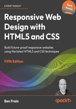
Responsive Web Design with HTML5 and CSS, Fifth Edition, is the very latest, up-to-date version of one of the bestselling books on HTML5 and CSS. It emphasizes pragmatic application, teaching the approaches needed to build websites and applications, with downloadable examples.Written in Ben's friendly and easy-to-follow style, this title can be read as a complete guide, or used as a reference for each topic.If you're a backend dev looking to understand the front of the web stack and its possibilities, or perhaps a frontend dev looking for a comprehensive resource on everything new in HTML and CSS to build the most efficient UIs, this is the book for you. Even if you are deferring your code writing to AI, this book gives you the requisite knowledge to understand the validity and efficiency of AI's output.Among the many topics, we cover approaches for better accessibility, utilizing variable fonts, explainers on the latest color manipulation techniques and functions, in-depth coverage of bleeding-edge features such as scroll-driven animations, view transitions, CSS anchor positioning, CSS layers, container queries, nesting, and much more.By the end, you'll not only have a thorough understanding of responsive web design and what's possible with the latest HTML5 and CSS, but also know how to best implement each technique.
Ben Frain
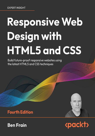
Responsive Web Design with HTML5 and CSS, Fourth Edition, is a fully revamped and extended version of one of the most comprehensive and bestselling books on the latest HTML5 and CSS techniques for responsive web design. It emphasizes pragmatic application, teaching you the approaches needed to build most real-life websites, with downloadable examples in every chapter.Written in the author's friendly and easy-to-follow style, this edition covers all the newest developments and improvements in responsive web design, including approaches for better accessibility, variable fonts and font loading, and the latest color manipulation tools making their way to browsers. You can enjoy coverage of bleeding-edge features such as CSS layers, container queries, nesting, and subgrid.The book concludes by exploring some exclusive tips and approaches for front-end development from the author.By the end of the book, you will not only have a comprehensive understanding of responsive web design and what is possible with the latest HTML5 and CSS, but also the knowledge of how to best implement each technique. Read through as a complete guide or dip in as a reference for each topic-focused chapter.
Ben Frain
Responsive Web Design with HTML5 and CSS, Third Edition is a renewed and extended version of one of the most comprehensive and bestselling books on the latest HTML5 and CSS tools and techniques for responsive web design.Written in the author's signature friendly and informal style, this edition covers all the newest developments and improvements in responsive web design including better user accessibility, variable fonts and font loading, CSS Scroll Snap, and much, much more. With a new chapter dedicated to CSS Grid, you will understand how it differs from the Flexbox layout mechanism and when you should use one over the other.Furthermore, you will acquire practical knowledge of SVG, writing accessible HTML markup, creating stunning aesthetics and effects with CSS, applying transitions, transformations, and animations, integrating media queries, and more. The book concludes by exploring some exclusive tips and approaches for front-end development from the author.By the end of this book, you will not only have a comprehensive understanding of responsive web design and what is possible with the latest HTML5 and CSS, but also the knowledge of how to best implement each technique.
Alex Libby, Gaurav Gupta, Asoj Talesra
Responsive web design (RWD) is a web design approach aimed at crafting sites to provide an optimal viewing and interaction experience—providing easy reading and navigation with minimum resizing, panning, and scrolling—and all of this across a wide range of devices from desktop computer monitors to mobile phones. Responsive web design is becoming more important as the amount of mobile traffic now accounts for more than half of the Internet’s total traffic.This book will give you in depth knowledge about the basics of responsive web design. You will embark on a journey of building effective responsive web pages that work across a range of devices, from mobile phones to smart TVs, with nothing more than standard markup and styling techniques.You'll begin by getting an understanding of what RWD is and its significance to the modern web. Building on the basics, you'll learn about layouts and media queries. Following this, we’ll dive into creating layouts using grid based templates. We’ll also cover the important topic of performance management, and discover how to tackle cross-browser challenges.
Ben Frain
Desktop-only websites just aren’t good enough anymore. With mobile internet usage still rising, and tablets changing internet consumption habits, you need to know how to build websites that will just ‘work’, regardless of the devices used to access them. This second edition of Responsive Web Design with HTML5 and CSS3 explains all the key approaches necessary to create and maintain a modern responsive design.The changing way in which we access the web means that there has never been a greater range of screen sizes and associated user experiences to consider. With these recent trends driving changes in design, typical desktop-only websites fail to meet even minimum expectations when it comes to style and usability, which can be vital when your website is central to yours or your client's brand. Responsive Web Design with HTML5 and CSS3, Second Edition is an updated and improved guide that responds to the latest challenges and trends in web design, giving you access to the most effective approaches to modern responsive design.Learn how to build websites with a “responsive and mobile first” methodology, allowing a website to display effortlessly on every device that accesses it. Packed with examples, and a thorough explanation of modern techniques and syntax, Responsive Web Design with HTML5 and CSS3, Second Edition provides a comprehensive resource for all things ‘responsive’.This updated new edition covers all the most up-to-date techniques and tools needed to build great responsive designs, ensuring that your projects won’t just be built ‘right’ for today, but in the future too.Chapter example code is all hosted on rwd.education, a dedicated site for the book, built by the author, using the approaches and techniques championed throughout.
Ben Frain
Tablets, smart phones and even televisions are being used increasingly to view the web. There's never been a greater range of screen sizes and associated user experiences to consider. Web pages built to be responsive provide the best possible version of their content to match the viewing devices of not just today's devices but tomorrow's too.Learn how to design websites according to the new responsive designù methodology, allowing a website to display beautifully on every screen size. Follow along, building and enhancing a responsive web design with HTML5 and CSS3. The book provides a practical understanding of these new technologies and techniques that are set to be the future of front-end web development. Starting with a static Photoshop composite, create a website with HTML5 and CSS3 which is flexible depending on the viewer's screen size.With HTML5, pages are leaner and more semantic. A fluid grid design and CSS3 media queries means designs can flex and adapt for any screen size. Beautiful backgrounds, box-shadows and animations will be added ñ all using the power, simplicity and flexibility of CSS3.Responsive web design with HTML5 and CSS3 provides the necessary knowledge to ensure your projects won't just be built right for today but also the future.